Components · Mobile only · Feedback
Coachmark
AlphaiOS & Android
A one-time hint pointing at a control, dismissed by the user.
Usage
@nexub/react-native
import { Coachmark } from '@nexub/react-native';

<Coachmark title="New: split bills" onDismiss={seen}>Tap here to split.</Coachmark>Interactive preview of @nexub/react-native rendered for the web. Native chrome (switches, pickers, Liquid Glass) looks like the platform on a device.
On device
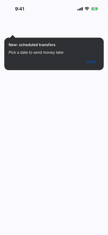
iPhone (iOS simulator)
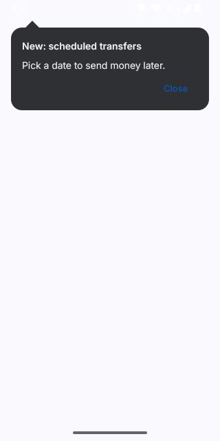
Pixel (Android emulator)
Screenshots from the latest CI run of the showcase app; the live frame renders the same code for the web.
Coachmark props
| Prop | Type | Default | Description |
|---|---|---|---|
| title | string | — | — |
| childrenrequired | string | — | — |
| arrow | 'top' | 'bottom' | 'top' | Which side the arrow is on (towards the thing it explains). |
| onDismissrequired | () => void | — | — |
| dismissLabel | string | — | Dismiss label. |
| style | StyleProp<ViewStyle> | — | — |